Nachhaltiges Design und umweltfreundliche Druckprodukte

Die Materialien die sich die Zielgruppe oder meine Kunden wünschen (und wir umsetzen) sind selten 100% umweltfreundlich. Doch nachhaltiges Design ist ein Prozess und als Designerin kann ich beraten und zumindest Realisierungsvorschläge geben, mit denen wir durch Konzeption und Gestaltung Produkte auf den Markt bringen, die in der Produktion umweltfreundlicher sind, weniger Materialverbrauch haben und wiederverwertbarer sind.

Immer häufiger erreichen wir unsere Zielgruppe über Social Media oder mit Online Ads, wir benutzen Veranstaltungs-App statt Programmheft oder rufen benötigte Informationen im Web ab, anstatt einen Katalog zu bestellen. Allerdings hat digitales Design noch immer nicht so die Druckprodukte ersetzt, wie wir es vor gut 10 Jahren noch erwartet hätten – wenn auch nur, um den Erstkontakt herzustellen oder auf digitale Informationen hinzuweisen. 

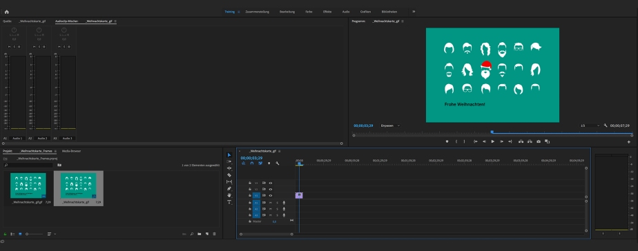
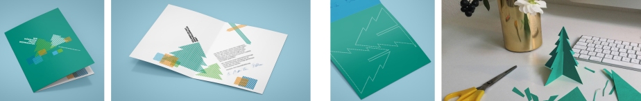
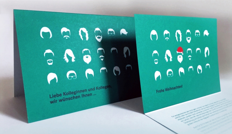
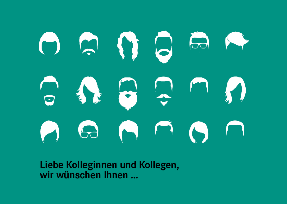
Egal welches Produkt Sie planen – Wir haben viele Ideen und Vorschläge, wie man dieses nachhaltiger umsetzen kann. Hier sind erste Beispiele für Konzeption und Produktion von Druckmaterialien:

Beispiel 1: Bei Broschüren, die mehrmals jährlich erscheinen, könnten bleibende Informationen in einem Heft gedruckt werden und dann durch eine Mappe oder mit einem Einleger ergänzt werden, der die aktuellen Informationen enthält. Da viele Druckmaterialien vorsorglich (oder unwissentlich) in zu großen Auflagen gedruckt werden, können diese Hefte dann auch für den nächsten Turnus wiederverwendet werden und nur die Informationen, die sich geändert haben, müssten ergänzt werden.  

Beispiel 2: Mit Verweise auf weitere Informationen im Web (link oder QR-Code) kann man viele Seiten einsparen. Außerdem sollten Druckmaterialien nicht nur zum Versand, sondern auch zum Download oder als PDF zum Empfang via E-Mail angeboten werden = Das schont die Umwelt UND das Budget. 

Beispiel 3: Löchert eure Druckerei mit Fragen nach…

  • Papier: Recyclingmaterial / Papier aus nachhaltiger Waldwirtschaft
  • Farbe: Auf pflanzenölbasis, kobaltfrei und ohne Mineralölanteil
  • Verzicht auf Isopropanol als Feuchtmittelzusatz
  • Wird Strom für die Produktion aus erneuerbaren Energien gewonnen
  • Werden Wertstoffe in den Verwertungskreislauf zurückgeführt 

Mein Fazit: Neben den offensichtlichen Vorteilen für die Umwelt, führen nachhaltige Konzepte immer auch zum Image-Gewinn unserer Kunden und günstiger sind sie teilweise sogar auch!

Was sind eure Top-Tipps für nachhaltigere Produktion und Unternehmensorganisation?

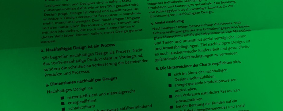
Ich habe die AGD-Charta für nachhaltiges Design unterschrieben. Hier könnt ihr es mir gleichtun: PDF

Für lokale Druckproduktion z.Bsp.: Umweltdruckhaus in Hannover  / Oeding Print in Braunschweig   

Hier noch ein interessanter Artikel über Werbematerialien, die mit Algentinte gedruckt wurden: Patagonia Reieseführer

Thanks for stopping by. Please stay in touch by following my blog here.

back to top

How to Get the Most Out of Your Budget (1): Individual Design Job

by Britta

When asked for an individual design job for a single medium, I always remind my clients to use their final artwork for different platforms in order to make the most of what they’ve paid for.

The creative part of a design job often takes up the most time and budget. After researching the target group and competitors, it involves creating the look and feel, coming up with an innovative idea, developing different layouts, discarding some of them and tweaking others. The next step – transferring the final design onto the print or online target media – is often much less time-consuming.

Every campaign requires advertisement on various platforms. While most channels are included in the concept up front, adding even more is comparable budget friendly, as the main part – creating an idea and design for your campaign – is already done and will only be multiplied to another format. The same applies to most other media: If you have a magazine, get a printed version as well as an e-book. If you place an ad, create an animated google-ad using the same elements. When your annual report is final, also offer a digital version for download on your website. If you advertise with flyers, use the slogan you came up with for a newsletter …

Example of a small project with a simple solution: A christmas card goes digital

Recently, one of my clients asked me to design their christmas card. They wanted a four-page card in an A6 format with a modern and fun design to send out to their 1.200 employees.

weihnachtskarte_konzepte

weihnachtskarte_final

I presented three initial concept ideas. The design versions went back and forth between me and the client as well as within their department until the final text and layout was chosen. The biggest chunk of the budget went to this creative process, followed by printing and direct addressing by the printers. Then, once the decision for a final design was made, it took little time and budget to also create a gif for my clients facebook page and a small mp4-video for their instagram account.

weihnachtskarte_animation

Not every print design is as easily transferred to an online platform as this card. Sometimes the content needs to be further developed to accompany existing channels and to suit the medium. Normally it’s worth it – make the most of what you’ve paid for!

If you are interested in a breakdown of costs for your next project, drop me a line at info@brittafocke.com

Thanks for stopping by. Please stay in touch by following my blog here.

back to top

Using Static Images With Motion Illusion

by Britta

Some platforms don’t allow videos or animated pics, but there are other ways to get the illusion of motion even though you’re using a static image. While not replacing a proper animation, they are simple to use and have a subtle, unexpected effect.

There are many fantastic pics out there with motion illusion. One thing I normally don’t like about them is their psychedelic design. Here are two examples with a more contemporary look and feel:

Motion Illusion6

Motion Illusion7

They work best in a narrow format such as a newsletter, where the motion illusion becomes apparent, once the user starts scrolling up and down the screen.

I first made use of this effect when I designed the newsletters, accompanying the campaigns for the new UTS Institute of Research and Open Day:

Motion Illusion_Examples of my work2

Motion Illusion_Examples of my work

While these motion illusions become apparent when the reader starts scrolling, there are similar images that work without and could be incorporated in a printed poster- or postcard design.

Any campaigns you can think of that might want to make use of this concept?
info@brittafocke.com

Thanks for stopping by. Please stay in touch by following my blog here.

back to top

Minimal Ads

by Britta

Taschen Bauhaus Tischlampe

I recently came across this ad from 1925, featured in Taschens’ book about the bauhaus period. It was deliberately factual, describing the technical highlights only. It appears almost naive in comparison to the complex colorful ads we’re used to today. Rom magazine though, is now trying a new (old) approach. As described in this article, their ads regain credibility through limiting their clients’ freedom in design.

ROM-magazin_Scan-10

I agree that sometimes less is more. Too much blabla distracts from the core message and good design needs a clear focal point. Our lesson: Nothing stands out if everything is highlighted as important. Also, when designing an ad, have in mind where it’s published. On a static website it might need some bling and a spread in an otherwise black and white newspaper might gain attention with a colourful design and bold typography. When advertising in a high-gloss magazine though, a design-reduced ad with white background will often be your best choice.

Thanks for stopping by. Please stay in touch by following my blog here.

back to top