by Britta


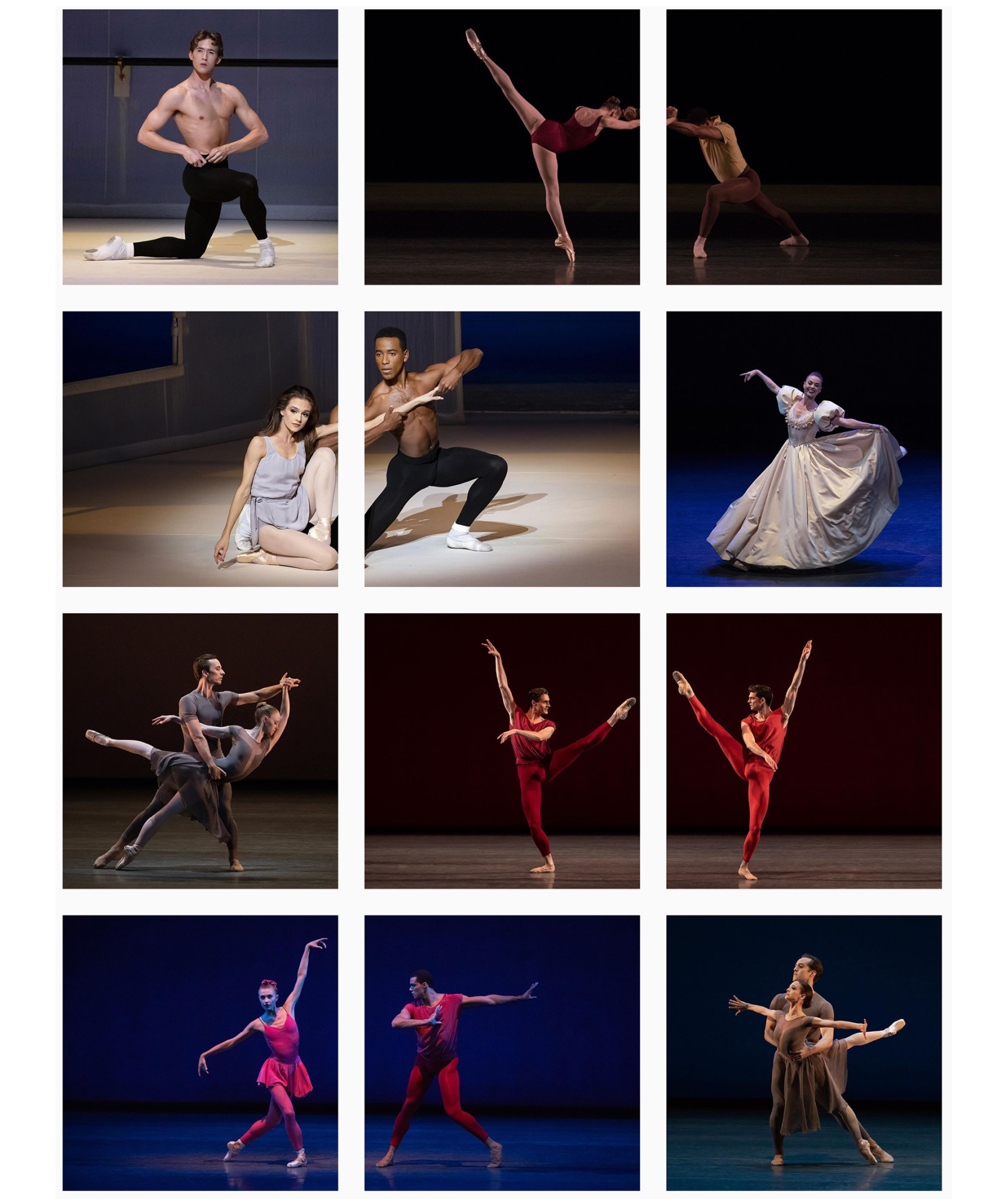
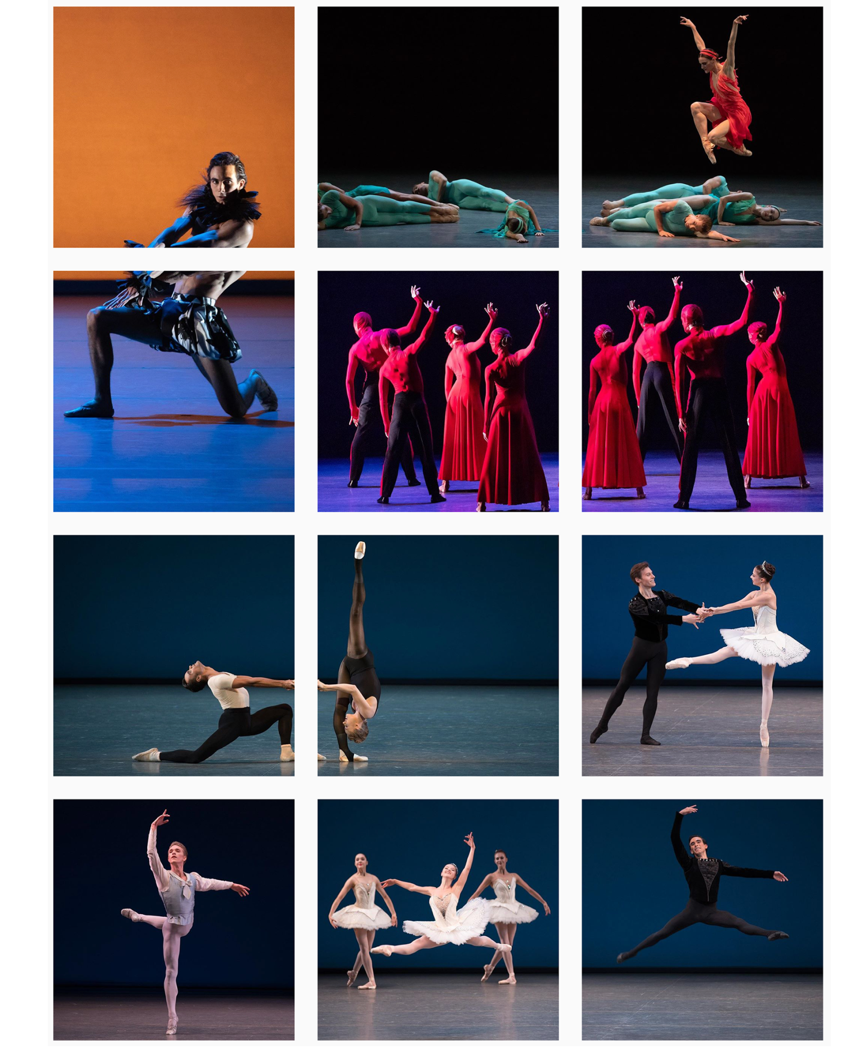
I’ve often used a similar concept for newsletter designs. This method triggers the reader to scroll down and reveal the full content and newsletter information.
Here are two examples of newsletters I’ve created for fashion-webshop Luxengo. Instead of one image for each category-link, I’ve used only one main image, split up into several smaller ones. Nice little side effect: We only had to buy one stock image instead of six.


There are many platforms where this concept might work well. Have you tried it on any other social media channels?
Thanks for stopping by. Please stay in touch by following my blog here.
