
mehr Info hier
Kategorie: Design Blog
Tips und Tricks, Design-Inspiration, News…

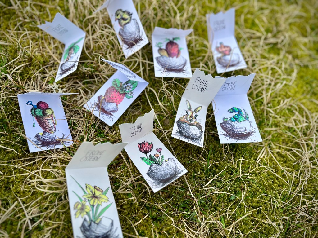
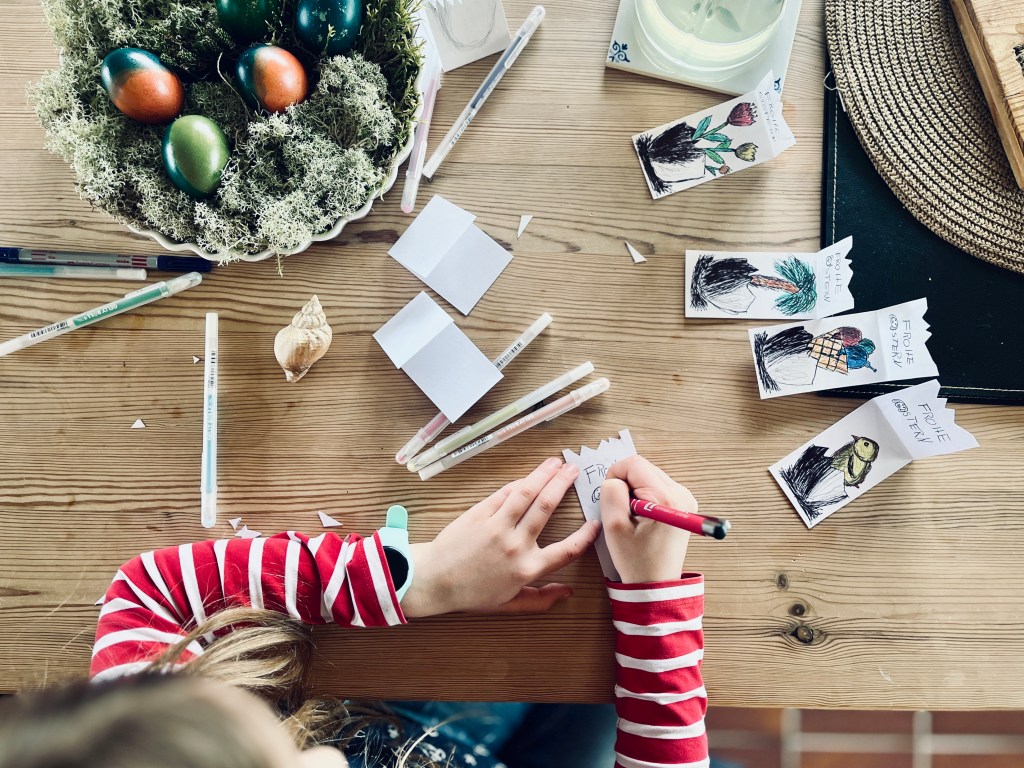
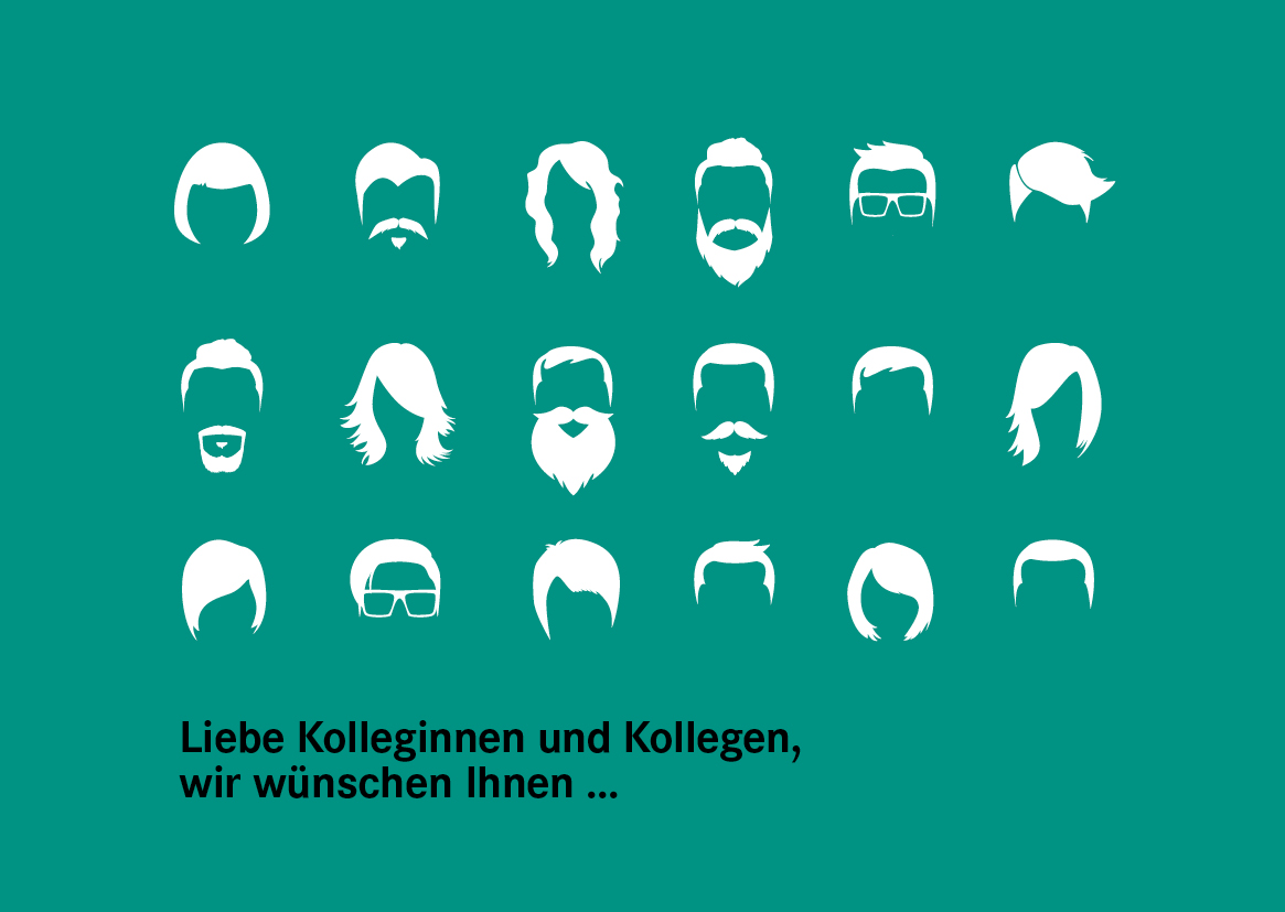
Frohe Ostern!
An einem verregneten Urlaubstag haben wir zu Schere, Kuli und Glitzerstift gegriffen. Herausgekommen sind viele individuelle Grußkarten. Zunächst noch mit den klassischen Ostermotiven wie Hase, Küken, Narzissen… später auch mit Palme, Eiswaffel und Meerestieren. Which one is your favorite?

Wie können wir Vielfalt darstellen und diskriminierende Sprache vermeiden?
Traurige Beispiele für rassistische Werbung 2020: Werbefails
Das NdM-Glossar gibt Formulierungshilfen für die Berichterstattung in der Einwanderungsgesellschaft: Glossar
Inklusive Sprache: leidmedien.de

Nachhaltiges Design und umweltfreundliche Druckprodukte
Die Materialien die sich die Zielgruppe oder meine Kunden wünschen (und wir umsetzen) sind selten 100% umweltfreundlich. Doch nachhaltiges Design ist ein Prozess und als Designerin kann ich beraten und zumindest Realisierungsvorschläge geben, mit denen wir durch Konzeption und Gestaltung Produkte auf den Markt bringen, die in der Produktion umweltfreundlicher sind, weniger Materialverbrauch haben und wiederverwertbarer sind.
Immer häufiger erreichen wir unsere Zielgruppe über Social Media oder mit Online Ads, wir benutzen Veranstaltungs-App statt Programmheft oder rufen benötigte Informationen im Web ab, anstatt einen Katalog zu bestellen. Allerdings hat digitales Design noch immer nicht so die Druckprodukte ersetzt, wie wir es vor gut 10 Jahren noch erwartet hätten – wenn auch nur, um den Erstkontakt herzustellen oder auf digitale Informationen hinzuweisen.
Egal welches Produkt Sie planen – Wir haben viele Ideen und Vorschläge, wie man dieses nachhaltiger umsetzen kann. Hier sind erste Beispiele für Konzeption und Produktion von Druckmaterialien:
Beispiel 1: Bei Broschüren, die mehrmals jährlich erscheinen, könnten bleibende Informationen in einem Heft gedruckt werden und dann durch eine Mappe oder mit einem Einleger ergänzt werden, der die aktuellen Informationen enthält. Da viele Druckmaterialien vorsorglich (oder unwissentlich) in zu großen Auflagen gedruckt werden, können diese Hefte dann auch für den nächsten Turnus wiederverwendet werden und nur die Informationen, die sich geändert haben, müssten ergänzt werden.
Beispiel 2: Mit Verweise auf weitere Informationen im Web (link oder QR-Code) kann man viele Seiten einsparen. Außerdem sollten Druckmaterialien nicht nur zum Versand, sondern auch zum Download oder als PDF zum Empfang via E-Mail angeboten werden = Das schont die Umwelt UND das Budget.
Beispiel 3: Löchert eure Druckerei mit Fragen nach…
- Papier: Recyclingmaterial / Papier aus nachhaltiger Waldwirtschaft
- Farbe: Auf pflanzenölbasis, kobaltfrei und ohne Mineralölanteil
- Verzicht auf Isopropanol als Feuchtmittelzusatz
- Wird Strom für die Produktion aus erneuerbaren Energien gewonnen
- Werden Wertstoffe in den Verwertungskreislauf zurückgeführt
Mein Fazit: Neben den offensichtlichen Vorteilen für die Umwelt, führen nachhaltige Konzepte immer auch zum Image-Gewinn unserer Kunden und günstiger sind sie teilweise sogar auch!
Was sind eure Top-Tipps für nachhaltigere Produktion und Unternehmensorganisation?
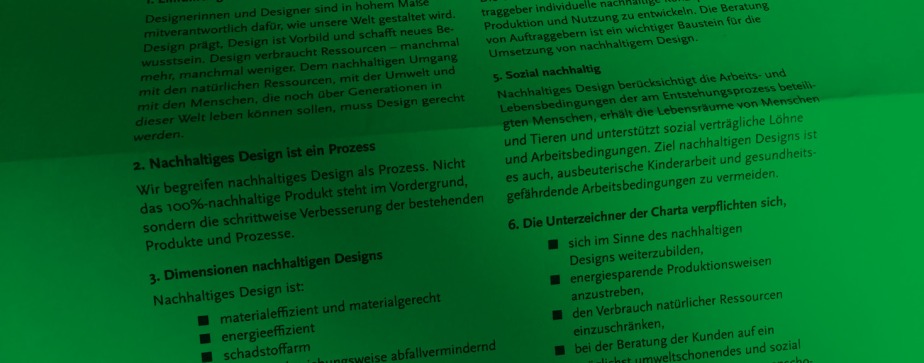
Ich habe die AGD-Charta für nachhaltiges Design unterschrieben. Hier könnt ihr es mir gleichtun: PDF
Für lokale Druckproduktion z.Bsp.: Umweltdruckhaus in Hannover / Oeding Print in Braunschweig
Hier noch ein interessanter Artikel über Werbematerialien, die mit Algentinte gedruckt wurden: Patagonia Reieseführer
Thanks for stopping by. Please stay in touch by following my blog here.

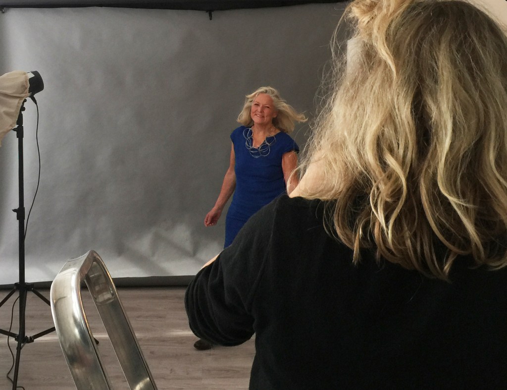
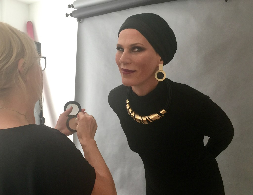
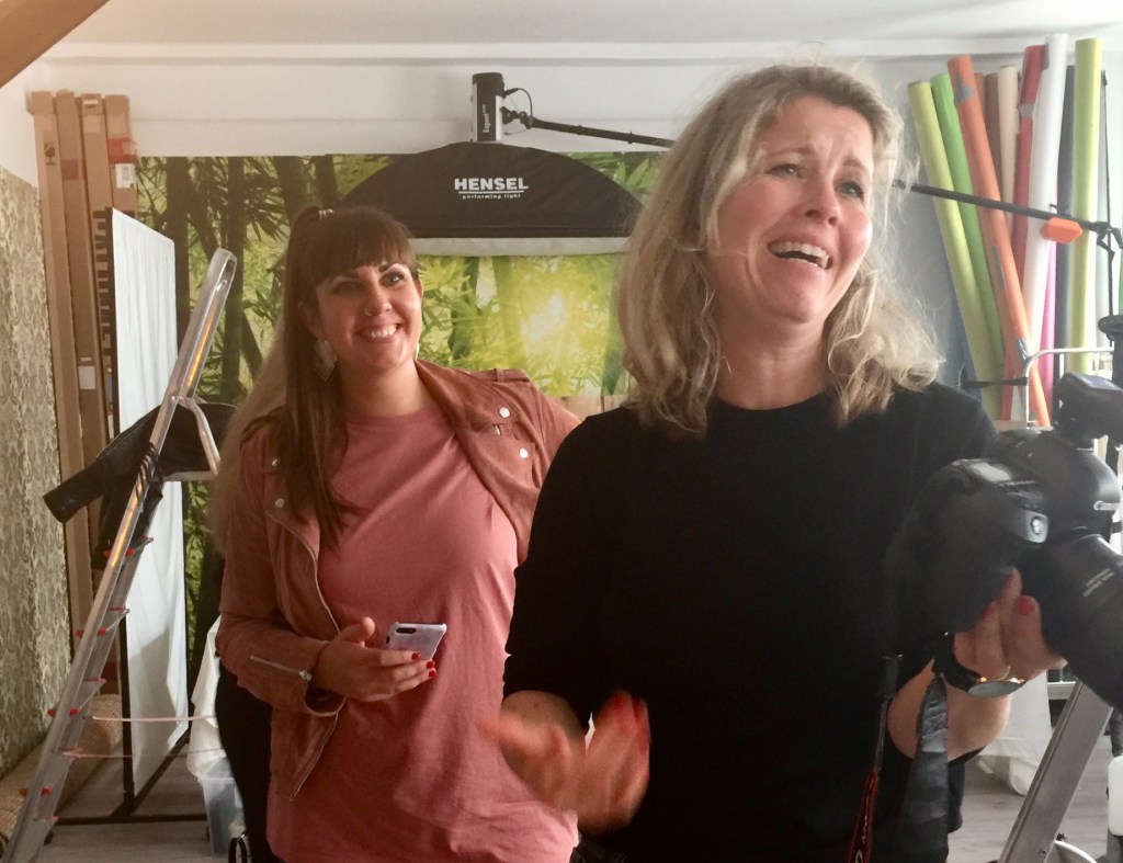
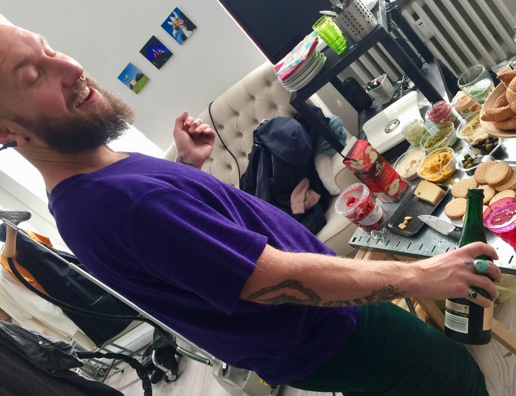
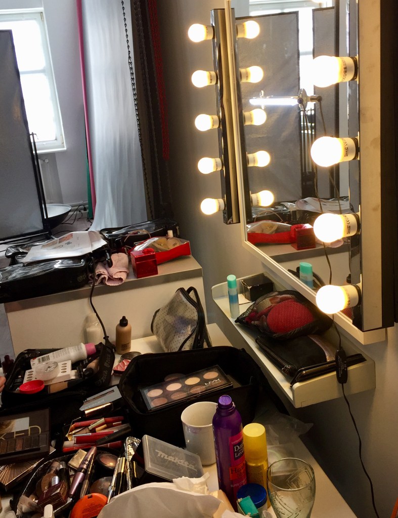
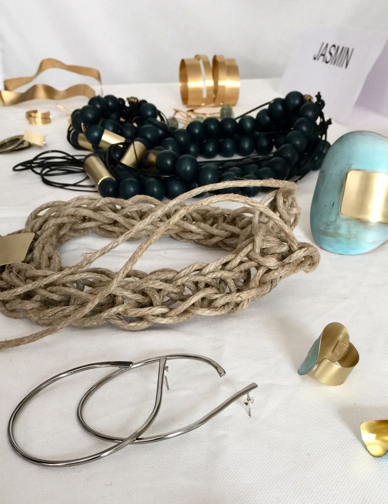
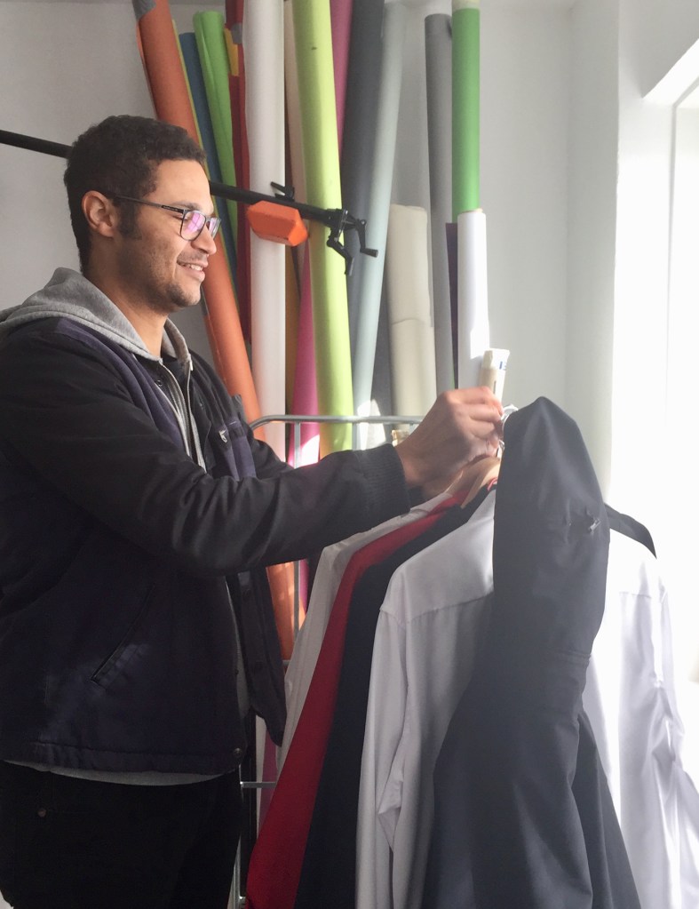
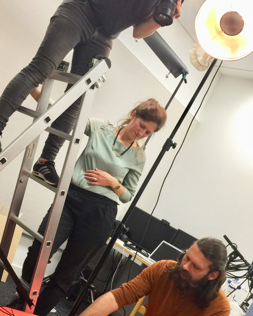
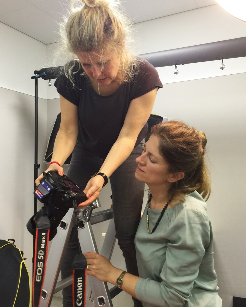
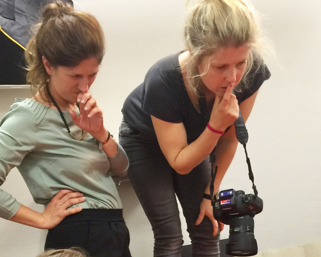
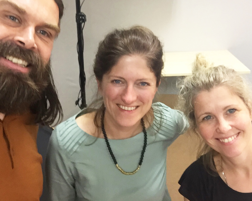
Another Project, Another Photoshoot, Another Peek ;)
We are currently working on the corporate design for a new jewelry online shop and store. This was our first visit to a studio with a diverse mix of models, nicely staged by photographer Andrea Seifert and make-up artist Janine Koehler.

Thanks for stopping by. Please stay in touch by following my blog here.
A Peek Behind The Scenes
Great things in the making! Stay tuned:
http://www.brittafocke.com
http://www.andreaseifert.de
http://www.tib.eu


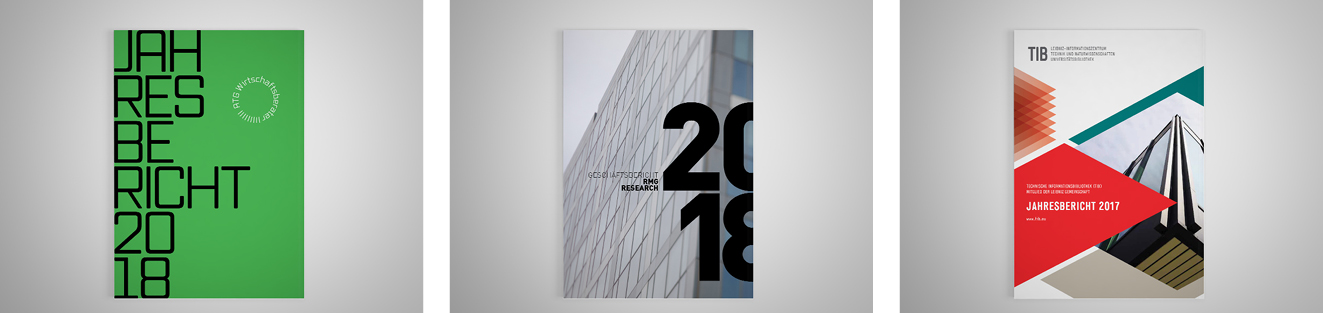
Erfolgreiches Design und effiziente Umsetzung für Ihren Geschäftsbericht
Es gibt mehrere Faktoren, die auch der Auftraggeber beeinflussen kann, um eine effiziente Umsetzung zu ermöglichen und somit die Kosten gering zu halten. Hier meine Tipps für einen erfolgreichen Geschäftsbericht.
WELCHES MEDIUM
Online, Druckausgabe oder PDF?
Die Inhalte für den Geschäftsbericht zu erstellen ist sehr arbeitsaufwendig. Es wäre schade, das Ergebnis nicht auf verschiedenen Kanälen zu präsentieren, um eine größtmögliche Lesergruppe zu erreichen. Auf der Webseite können die Inhalte mit Videos und Animationen ergänzt werden. Die Mehrzahl der Nutzer bevorzugt für den Geschäftsbericht aber weiterhin auch eine gedruckte Ausgabe oder eine PDF-Version.
Sobald der Bericht im Druck ist, kann mit wenig Zeit und Aufwand ein ergänzendes PDF für die Webseite erstellt werden. Umgekehrt kann, falls ursprünglich nur eine digitale Version geplant war, das fertige Web-PDF meistens problemlos für den Druck aufgearbeitet werden.
Vorteile Druckausgabe
- Die meisten Nutzer bevorzugen nach wie vor die gedruckte Ausgabe.
- Neben der Vielzahl an digitalen Informationen, sticht ein Bericht auf gutem Papier, hervor.
- Der Empfänger fühlt sich wertgeschätzt, wenn ihm eine gedruckte Ausgabe zugeschickt wird.
- Viele Nutzer mögen die Möglichkeit, Textstellen zu markieren oder Notizen zu machen und Informationen nachschlagen zu können.
- Auch kleinere Auflagen sind inzwischen, dank digitaler Druckverfahren, relativ kostengünstig.
- Einzelne Textabschnitte können mit Weblinks verknüpft werden.
- Navigations-Buttons verlinken vom Inhaltsverzeichnis zu entsprechenden Textstellen.
- Video- und Audio-Inhalte können eingebettet werden.
- PDF kann kostengünstig via E-Mail versendet und zum Download auf der Webseite angeboten werden.
 ZIELGRUPPE DEFINIEREN
Inhalt und Schreibstil sind unterschiedlich, je nachdem, welche Zielgruppe angesprochen werden soll. Auch das Design des Berichts möchte sich mit seiner Aufmachung an den Endnutzer wenden.
Manche Gesellschaften und Unternehmen sind durch Gesetze und Vorschriften verpflichtet einen Jahresabschluss und Lagebericht zu veröffentlichen. Für andere bietet der Geschäftsbericht die Möglichkeit, mit einer bestimmten Zielgruppe in Kontakt zu treten und wichtige Botschaften zu kommunizieren. An wen wendet sich der Bericht? Welche Informationen sollen kommuniziert werden? Zum Beispiel:
ZIELGRUPPE DEFINIEREN
Inhalt und Schreibstil sind unterschiedlich, je nachdem, welche Zielgruppe angesprochen werden soll. Auch das Design des Berichts möchte sich mit seiner Aufmachung an den Endnutzer wenden.
Manche Gesellschaften und Unternehmen sind durch Gesetze und Vorschriften verpflichtet einen Jahresabschluss und Lagebericht zu veröffentlichen. Für andere bietet der Geschäftsbericht die Möglichkeit, mit einer bestimmten Zielgruppe in Kontakt zu treten und wichtige Botschaften zu kommunizieren. An wen wendet sich der Bericht? Welche Informationen sollen kommuniziert werden? Zum Beispiel:
- Mitglieder über Änderungen und Entwicklungen informieren
- Unternehmensstrategie an Mitarbeiter kommunizieren
- Gegenüber Spendern Bilanz ziehen, was mit ihrem Geld erreicht wurde
- Potenzielle Investoren ansprechen, indem Erfolge aufgelistet werden
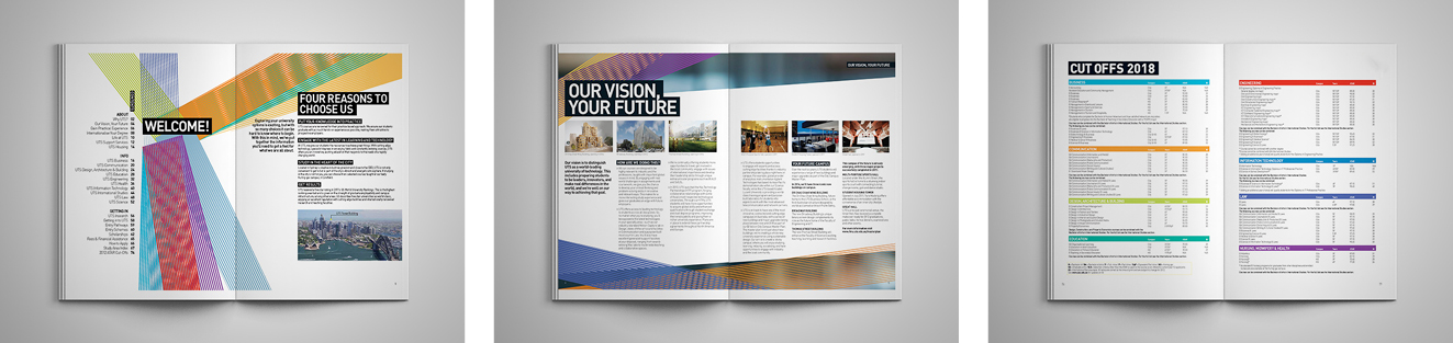
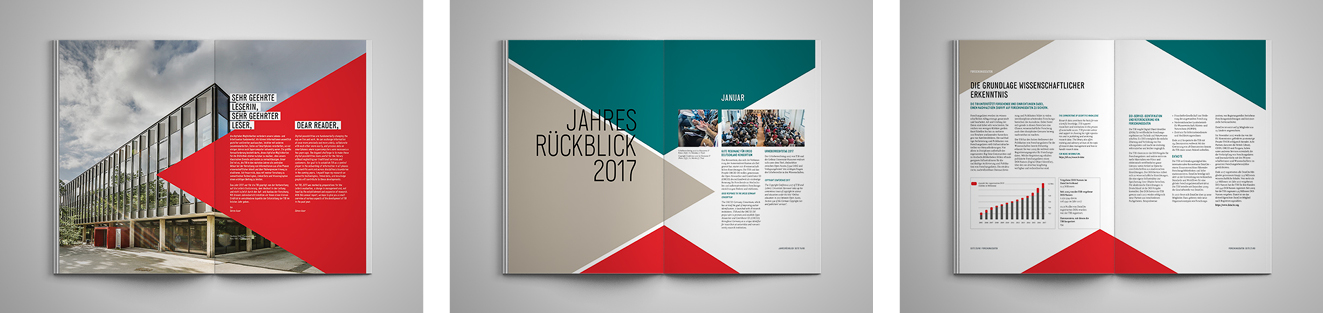 BILDER UND GRAFIKEN
Soll ein Bildkonzept erstellt und ein Fotoshooting organisiert werden oder soll der Designer bereits bestehende Bilder überarbeiten?
Bildqualität
Die Qualität der Fotos und eine einheitliche Bildästhetik entscheiden maßgeblich über die Qualität des gesamten Geschäftsberichts. Allerdings werden häufig Fotos geliefert, die von Mitarbeitern und Veranstaltungsteilnehmern im Laufe des Jahres gemacht wurden. Fotos von Laien haben aber leider oft eine zu geringe Auflösung oder benötigen eine aufwendige Retusche.
Manchmal ist es besser nur wenige gute, anstatt viele schlechte Fotos, zu zeigen. Stattdessen könnte der Geschäftsbericht mit einer grafischen Welt oder plakativer Typografie aufgelockert werden. Die beste Lösung ist aber oft ein neues Fotoshooting für Mitarbeiter und Räumlichkeiten. Hier besteht auch die Möglichkeit, mehrere Stimmungsbilder zu erstellen. Diese könnten später als Gestaltungshintergrund, auf Doppelseiten zur Einleitung des nächsten Kapitels oder zum Trennen einzelner Abschnitte verwendet werden.
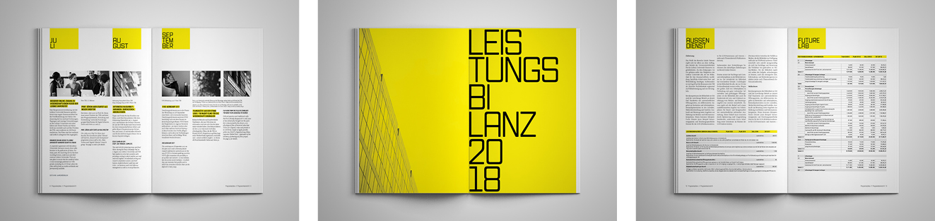
Grafiken und Tabellen
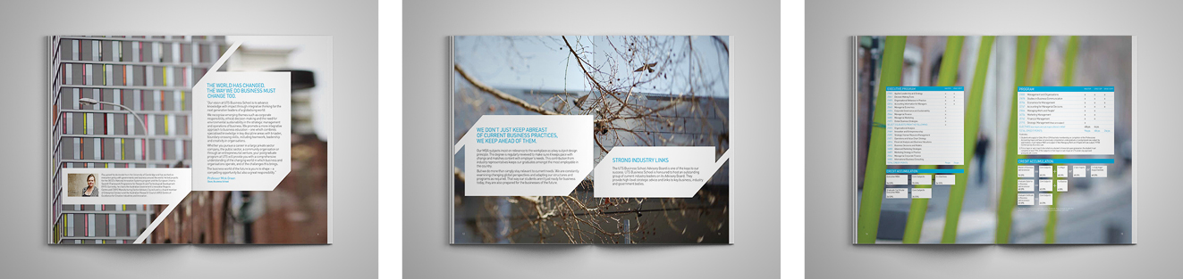
Der Designer bietet die Umsetzung unterschiedlicher Infografiken an. Dazu gehören u. a. Kreis-, Linien- und Säulendiagramme, die grafische Darstellung der Prozessabläufe, Land- und Weltkarten, das Organigramm, sowie die Zusammenfassung der Kennzahlen in einheitlichen Tabellen.
Infografiken sind für einen Bericht unentbehrlich und es lohnt, diese visuell ansprechend aufzuarbeiten und nach Corporate Design-Vorgaben zu vereinheitlichen. Diese Phase des Designprozesses macht einen Großteil der Designarbeit aus – die Anzahl der Grafiken und Tabellen wird also bei der Kostenkalkulation berücksichtigt.
BILDER UND GRAFIKEN
Soll ein Bildkonzept erstellt und ein Fotoshooting organisiert werden oder soll der Designer bereits bestehende Bilder überarbeiten?
Bildqualität
Die Qualität der Fotos und eine einheitliche Bildästhetik entscheiden maßgeblich über die Qualität des gesamten Geschäftsberichts. Allerdings werden häufig Fotos geliefert, die von Mitarbeitern und Veranstaltungsteilnehmern im Laufe des Jahres gemacht wurden. Fotos von Laien haben aber leider oft eine zu geringe Auflösung oder benötigen eine aufwendige Retusche.
Manchmal ist es besser nur wenige gute, anstatt viele schlechte Fotos, zu zeigen. Stattdessen könnte der Geschäftsbericht mit einer grafischen Welt oder plakativer Typografie aufgelockert werden. Die beste Lösung ist aber oft ein neues Fotoshooting für Mitarbeiter und Räumlichkeiten. Hier besteht auch die Möglichkeit, mehrere Stimmungsbilder zu erstellen. Diese könnten später als Gestaltungshintergrund, auf Doppelseiten zur Einleitung des nächsten Kapitels oder zum Trennen einzelner Abschnitte verwendet werden.
Grafiken und Tabellen
Der Designer bietet die Umsetzung unterschiedlicher Infografiken an. Dazu gehören u. a. Kreis-, Linien- und Säulendiagramme, die grafische Darstellung der Prozessabläufe, Land- und Weltkarten, das Organigramm, sowie die Zusammenfassung der Kennzahlen in einheitlichen Tabellen.
Infografiken sind für einen Bericht unentbehrlich und es lohnt, diese visuell ansprechend aufzuarbeiten und nach Corporate Design-Vorgaben zu vereinheitlichen. Diese Phase des Designprozesses macht einen Großteil der Designarbeit aus – die Anzahl der Grafiken und Tabellen wird also bei der Kostenkalkulation berücksichtigt.
 WEITERE TIPPS, UM KOSTEN GERING ZU HALTEN
Umfang
Texte die es auf den Punkt bringen, verringern nicht nur die Kosten, sondern erhöhen oft auch die inhaltliche Qualität. Weitere Informationen könnten anhand von Weblinks mit dem Vermerk ‚zum Weiterlesen‘ angeboten werden. Wenn im laufenden Jahr zum Beispiel im Blog über Veranstaltungen geschrieben wurde, könnte der Geschäftsbericht diese in Zusammenhang stellen und für weitere Informationen auf den entsprechenden Post verlinken oder ein Video über die Veranstaltung einbetten.
Vollständigkeit und Lektorat
Wenn der Inhalt nachträglich ergänzt oder gekürzt wird, kann es passieren, dass zusammengehörende Texte und Bilder nicht mehr gemeinsamen auf einer Seite stehen. Dies betrifft dann womöglich auch alle Folgeseiten des Kapitels und das Layout muss unter Umständen komplett neu aufgebaut werden. Auch nachträgliche Korrekturen der Rechtschreibung und Grammatik sind zeitaufwendig.
Wenn Sie Texte vollständig liefern und vor der Designphase revidieren, vermeiden Sie Kosten, die durch zusätzliche Korrekturschleifen entstehen.
INDIVIDUELLES ANGEBOT
Ich habe bereits viele Strategieberichte, Imagebroschüren, Donor Reports, Nachhaltigkeits- und Jahresberichte erstellt. Die Anforderungen sind immer gleich: Tolles Design bei schneller und kostengünstiger Umsetzung!
Je nach Art und Umfang Ihres Geschäftsberichts, greife ich für die Umsetzung auf mein Netzwerk von Fotografen, Illustratoren und Redakteure zurück, bleibe dabei aber von A bis Z Ihr persönlicher Ansprechpartner.
Mithilfe unserer Checkliste Geschäftsbericht, können Sie wählen, welche Arbeitsphasen in Ihrer Hand bleiben und welche wir übernehmen sollen. Danach einfach anrufen oder eine kurze E-Mail an: info@brittafocke.com – Ich würde gerne mit Ihnen zusammen arbeiten!
Thanks for stopping by. Please stay in touch by following my blog here.
back to top
WEITERE TIPPS, UM KOSTEN GERING ZU HALTEN
Umfang
Texte die es auf den Punkt bringen, verringern nicht nur die Kosten, sondern erhöhen oft auch die inhaltliche Qualität. Weitere Informationen könnten anhand von Weblinks mit dem Vermerk ‚zum Weiterlesen‘ angeboten werden. Wenn im laufenden Jahr zum Beispiel im Blog über Veranstaltungen geschrieben wurde, könnte der Geschäftsbericht diese in Zusammenhang stellen und für weitere Informationen auf den entsprechenden Post verlinken oder ein Video über die Veranstaltung einbetten.
Vollständigkeit und Lektorat
Wenn der Inhalt nachträglich ergänzt oder gekürzt wird, kann es passieren, dass zusammengehörende Texte und Bilder nicht mehr gemeinsamen auf einer Seite stehen. Dies betrifft dann womöglich auch alle Folgeseiten des Kapitels und das Layout muss unter Umständen komplett neu aufgebaut werden. Auch nachträgliche Korrekturen der Rechtschreibung und Grammatik sind zeitaufwendig.
Wenn Sie Texte vollständig liefern und vor der Designphase revidieren, vermeiden Sie Kosten, die durch zusätzliche Korrekturschleifen entstehen.
INDIVIDUELLES ANGEBOT
Ich habe bereits viele Strategieberichte, Imagebroschüren, Donor Reports, Nachhaltigkeits- und Jahresberichte erstellt. Die Anforderungen sind immer gleich: Tolles Design bei schneller und kostengünstiger Umsetzung!
Je nach Art und Umfang Ihres Geschäftsberichts, greife ich für die Umsetzung auf mein Netzwerk von Fotografen, Illustratoren und Redakteure zurück, bleibe dabei aber von A bis Z Ihr persönlicher Ansprechpartner.
Mithilfe unserer Checkliste Geschäftsbericht, können Sie wählen, welche Arbeitsphasen in Ihrer Hand bleiben und welche wir übernehmen sollen. Danach einfach anrufen oder eine kurze E-Mail an: info@brittafocke.com – Ich würde gerne mit Ihnen zusammen arbeiten!
Thanks for stopping by. Please stay in touch by following my blog here.
back to top 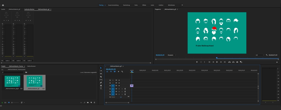
How to Get the Most Out of Your Budget (1): Individual Design Job
by Britta
When asked for an individual design job for a single medium, I always remind my clients to use their final artwork for different platforms in order to make the most of what they’ve paid for.
The creative part of a design job often takes up the most time and budget. After researching the target group and competitors, it involves creating the look and feel, coming up with an innovative idea, developing different layouts, discarding some of them and tweaking others. The next step – transferring the final design onto the print or online target media – is often much less time-consuming.
Every campaign requires advertisement on various platforms. While most channels are included in the concept up front, adding even more is comparable budget friendly, as the main part – creating an idea and design for your campaign – is already done and will only be multiplied to another format. The same applies to most other media: If you have a magazine, get a printed version as well as an e-book. If you place an ad, create an animated google-ad using the same elements. When your annual report is final, also offer a digital version for download on your website. If you advertise with flyers, use the slogan you came up with for a newsletter …
Example of a small project with a simple solution: A christmas card goes digital
Recently, one of my clients asked me to design their christmas card. They wanted a four-page card in an A6 format with a modern and fun design to send out to their 1.200 employees.
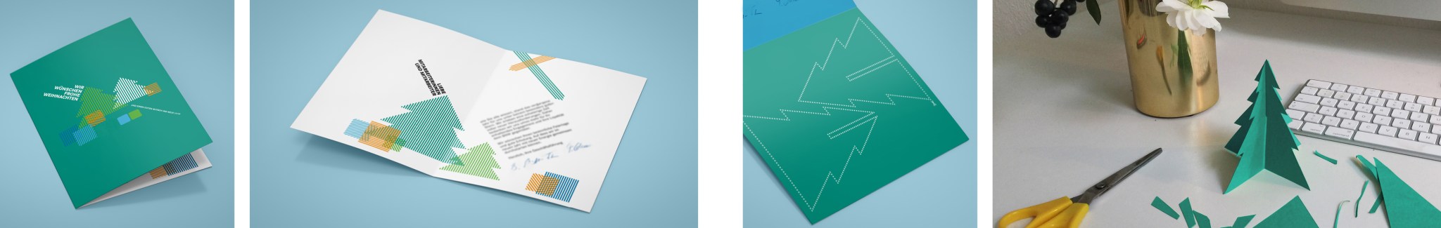
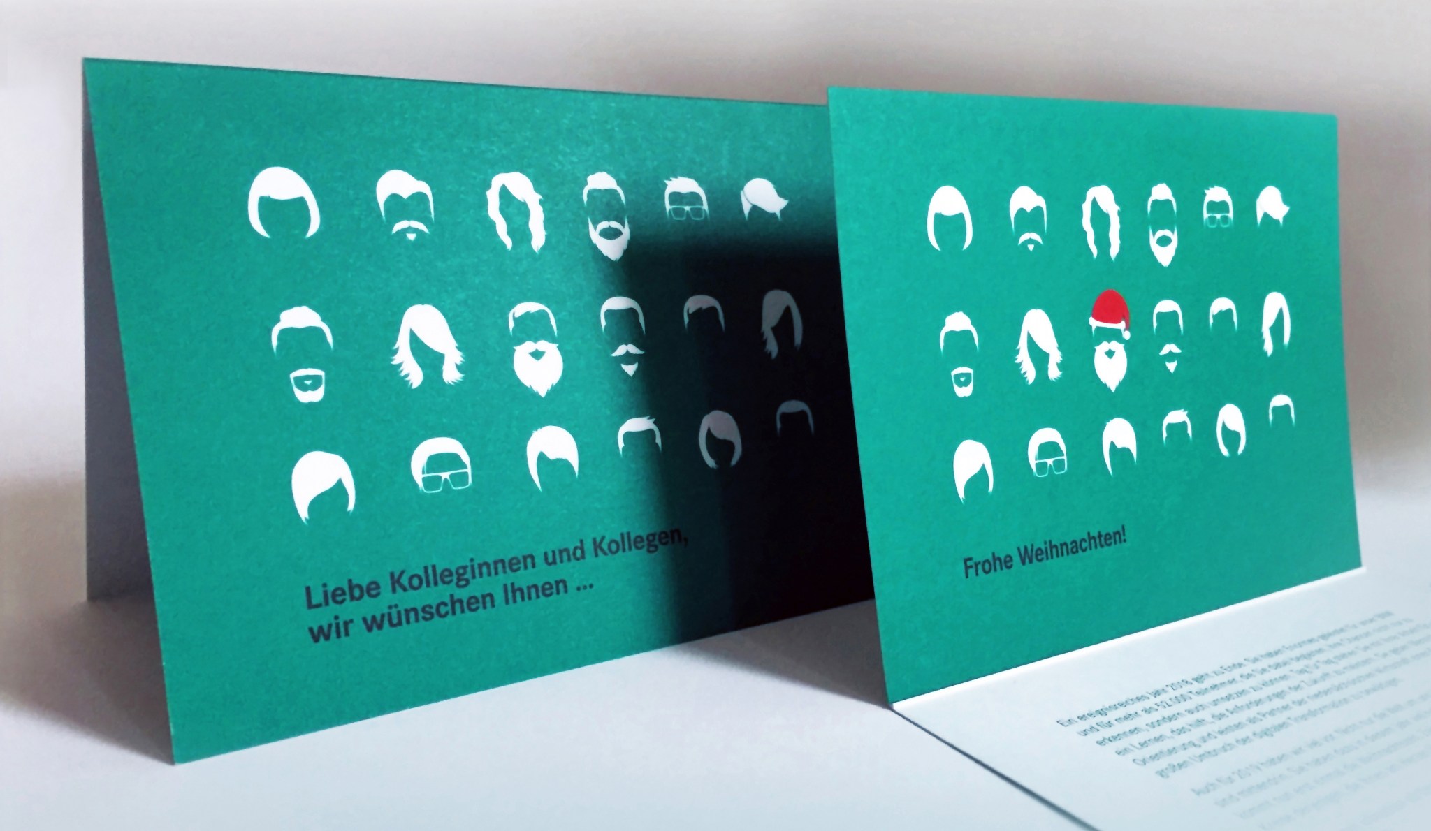
I presented three initial concept ideas. The design versions went back and forth between me and the client as well as within their department until the final text and layout was chosen. The biggest chunk of the budget went to this creative process, followed by printing and direct addressing by the printers. Then, once the decision for a final design was made, it took little time and budget to also create a gif for my clients facebook page and a small mp4-video for their instagram account.
Not every print design is as easily transferred to an online platform as this card. Sometimes the content needs to be further developed to accompany existing channels and to suit the medium. Normally it’s worth it – make the most of what you’ve paid for!
If you are interested in a breakdown of costs for your next project, drop me a line at info@brittafocke.com
Thanks for stopping by. Please stay in touch by following my blog here.

Using Static Images With Motion Illusion
by Britta
Some platforms don’t allow videos or animated pics, but there are other ways to get the illusion of motion even though you’re using a static image. While not replacing a proper animation, they are simple to use and have a subtle, unexpected effect.
There are many fantastic pics out there with motion illusion. One thing I normally don’t like about them is their psychedelic design. Here are two examples with a more contemporary look and feel:
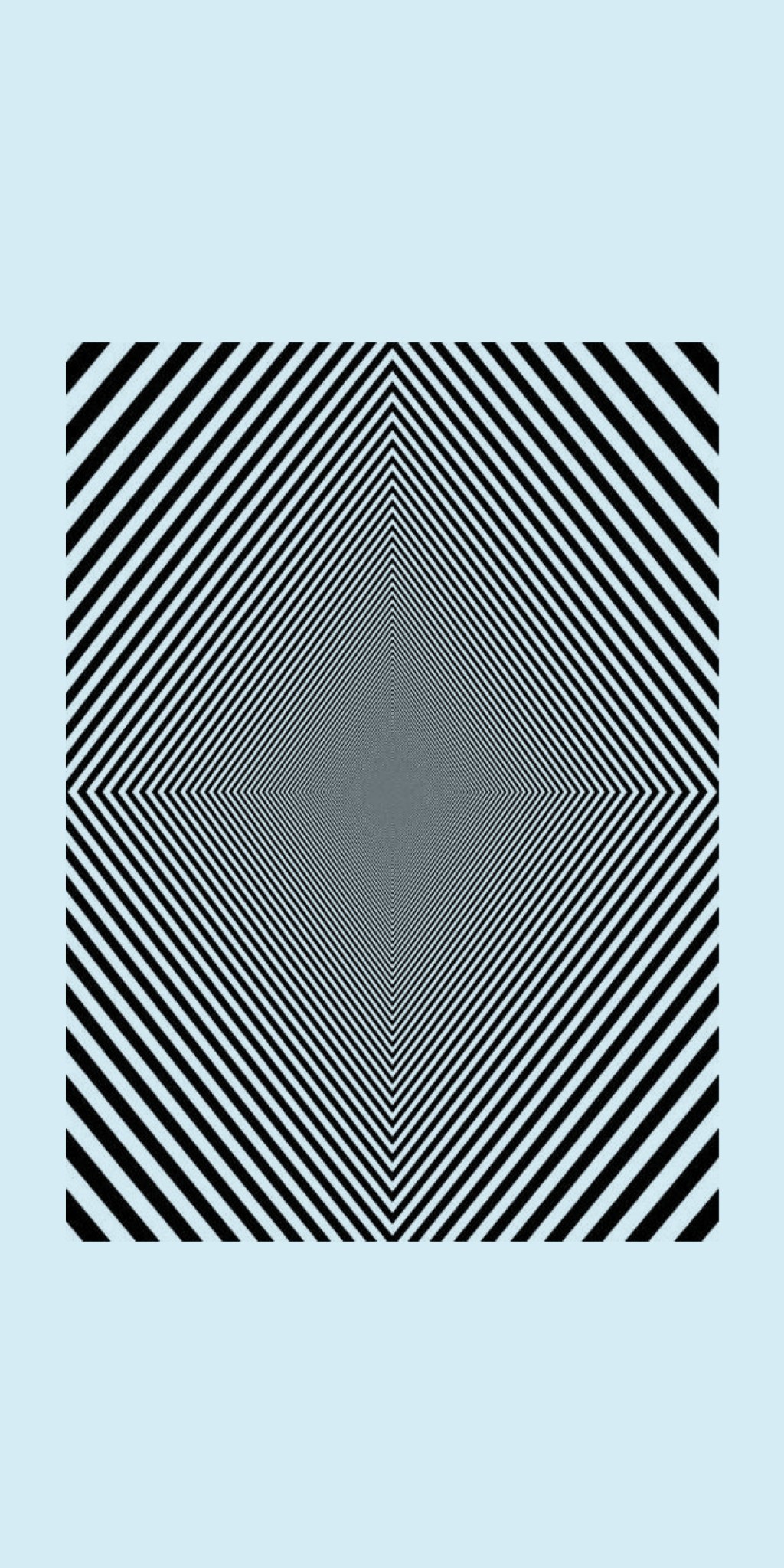
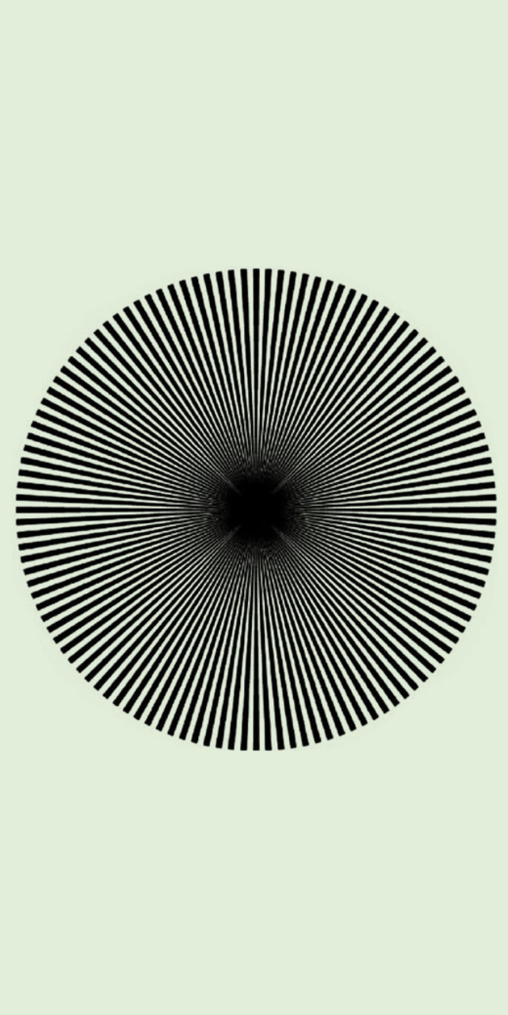
They work best in a narrow format such as a newsletter, where the motion illusion becomes apparent, once the user starts scrolling up and down the screen.
I first made use of this effect when I designed the newsletters, accompanying the campaigns for the new UTS Institute of Research and Open Day:
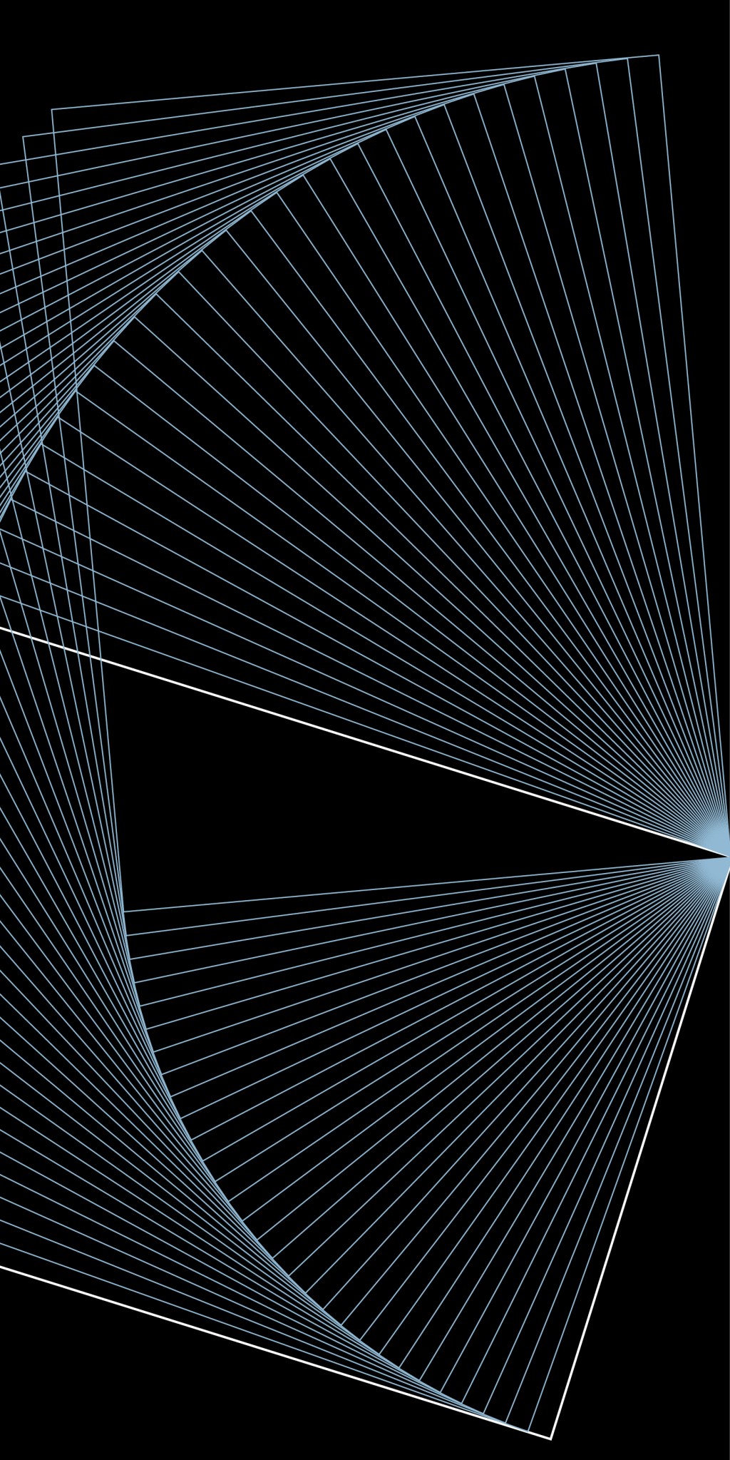

While these motion illusions become apparent when the reader starts scrolling, there are similar images that work without and could be incorporated in a printed poster- or postcard design.
Any campaigns you can think of that might want to make use of this concept?
info@brittafocke.com
Thanks for stopping by. Please stay in touch by following my blog here.

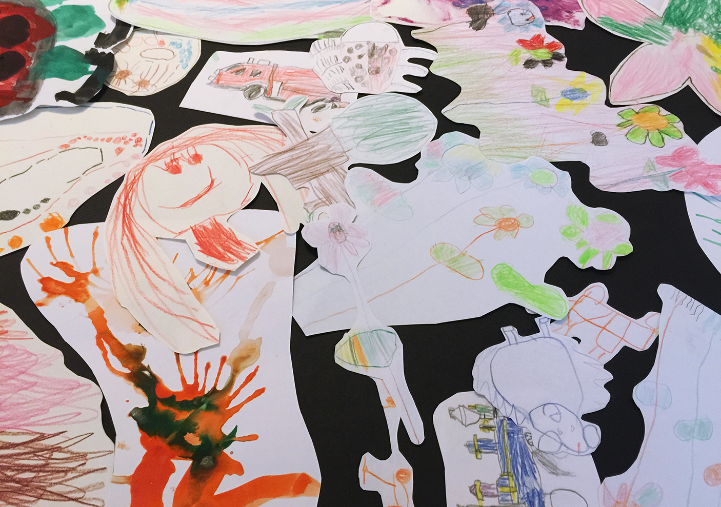
How to Keep Up With Your Kids Artwork
I have two little artists at home, creating drawings on a daily basis. Some of them are beautiful stand-alone pieces. Many others are smaller, half done doodles. At the end of the year, we normally go through their portfolio and decide which ones to keep and what to do with the other pile – too many to store, too precious to toss. Any ideas?
My son suggested to cut out all the smaller individual pieces and glue them onto colored cardboards. That way we created several large collages. The biggest one fits a 720 x 1000 cm picture frame and now takes pride on my office wall.
–
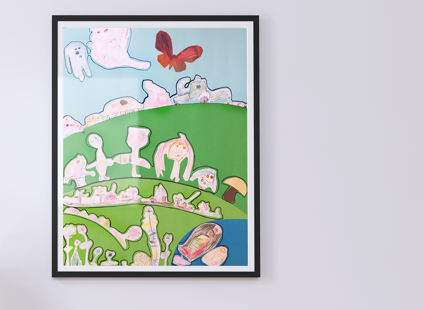
We created differently themed sections: Fishes (and some unidentifiable creatures) into the pond. Flowers onto the lawn. Cars and trucks behind each other („in a traffic jam!“). Butterfly and monsters, flying in the sky ;)
