Wie nutzt ihr Twitch?

Twitch hat täglich 15 Millionen aktive Nutzer, die meisten davon sind Gamer, 81% sind männlich und 55% zwischen 18 und 34 Jahre alt. Für Recruiting und Marketing ist die Plattform also hervorragende geeignet, um beispielsweise Tech- und IT-Nerds anzusprechen.

Ich wurde gebeten, ein Icon für einen neuen Twitch-Kanal zum Thema Wissenschaft zu erstellen. ForschungsStrom wird von Kollegen der Helmholtz-Gemeinschaft, TIB Hannover und dem Forschungszentrum Jülich angeboten. Alle 2–3 Wochen ‘strömen’ sie Wissenschaft. Im ersten Video ging es u.a. darum, wann und warum wir graue Haare bekommen ;)

Bietet sich neben den ganzen Fortnite-Videos auch eine Plattform für die Wissenschaft? Ich bin gespannt, wie sich der Kanal entwickelt und freue mich schon auf die nächste Folge am Do. 2. Juli 2020 ab 21 Uhr.

How to Get the Most Out of Your Budget (1): Individual Design Job

by Britta

When asked for an individual design job for a single medium, I always remind my clients to use their final artwork for different platforms in order to make the most of what they’ve paid for.

The creative part of a design job often takes up the most time and budget. After researching the target group and competitors, it involves creating the look and feel, coming up with an innovative idea, developing different layouts, discarding some of them and tweaking others. The next step – transferring the final design onto the print or online target media – is often much less time-consuming.

Every campaign requires advertisement on various platforms. While most channels are included in the concept up front, adding even more is comparable budget friendly, as the main part – creating an idea and design for your campaign – is already done and will only be multiplied to another format. The same applies to most other media: If you have a magazine, get a printed version as well as an e-book. If you place an ad, create an animated google-ad using the same elements. When your annual report is final, also offer a digital version for download on your website. If you advertise with flyers, use the slogan you came up with for a newsletter …

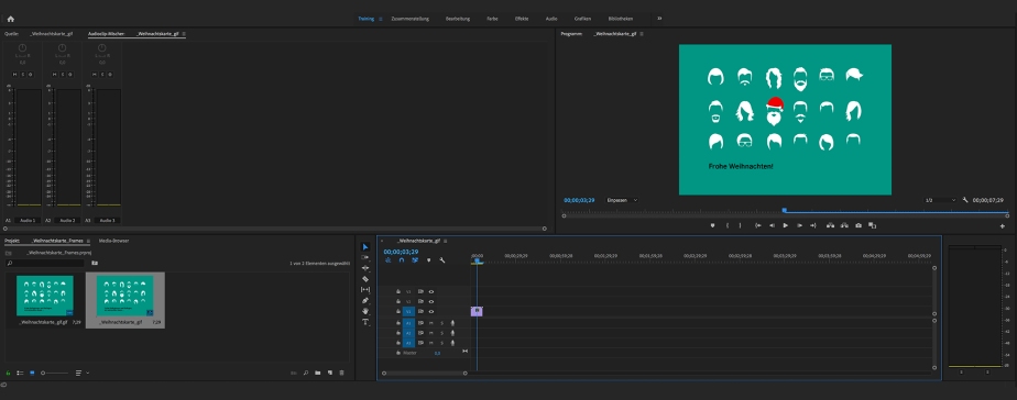
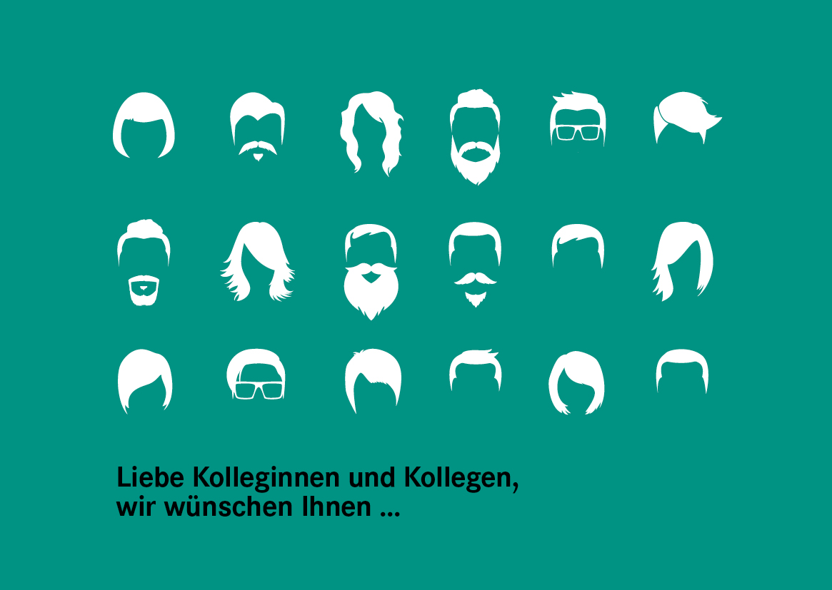
Example of a small project with a simple solution: A christmas card goes digital

Recently, one of my clients asked me to design their christmas card. They wanted a four-page card in an A6 format with a modern and fun design to send out to their 1.200 employees.

weihnachtskarte_konzepte

weihnachtskarte_final

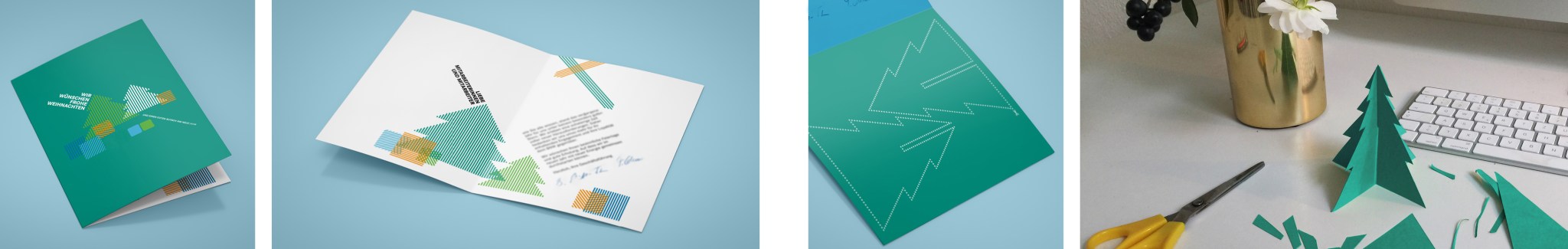
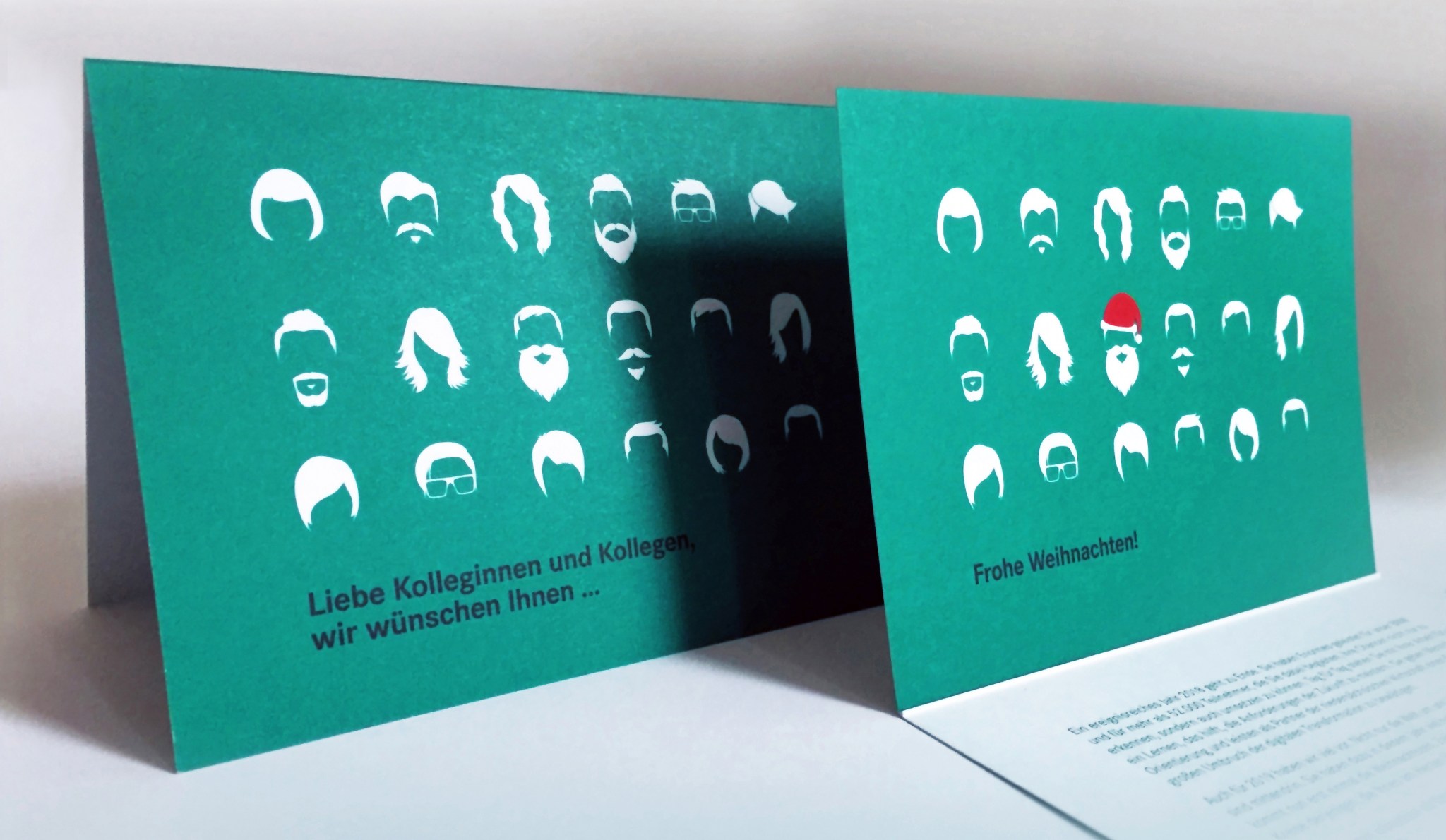
I presented three initial concept ideas. The design versions went back and forth between me and the client as well as within their department until the final text and layout was chosen. The biggest chunk of the budget went to this creative process, followed by printing and direct addressing by the printers. Then, once the decision for a final design was made, it took little time and budget to also create a gif for my clients facebook page and a small mp4-video for their instagram account.

weihnachtskarte_animation

Not every print design is as easily transferred to an online platform as this card. Sometimes the content needs to be further developed to accompany existing channels and to suit the medium. Normally it’s worth it – make the most of what you’ve paid for!

If you are interested in a breakdown of costs for your next project, drop me a line at info@brittafocke.com

Thanks for stopping by. Please stay in touch by following my blog here.

back to top

Using Static Images With Motion Illusion

by Britta

Some platforms don’t allow videos or animated pics, but there are other ways to get the illusion of motion even though you’re using a static image. While not replacing a proper animation, they are simple to use and have a subtle, unexpected effect.

There are many fantastic pics out there with motion illusion. One thing I normally don’t like about them is their psychedelic design. Here are two examples with a more contemporary look and feel:

Motion Illusion6

Motion Illusion7

They work best in a narrow format such as a newsletter, where the motion illusion becomes apparent, once the user starts scrolling up and down the screen.

I first made use of this effect when I designed the newsletters, accompanying the campaigns for the new UTS Institute of Research and Open Day:

Motion Illusion_Examples of my work2

Motion Illusion_Examples of my work

While these motion illusions become apparent when the reader starts scrolling, there are similar images that work without and could be incorporated in a printed poster- or postcard design.

Any campaigns you can think of that might want to make use of this concept?
info@brittafocke.com

Thanks for stopping by. Please stay in touch by following my blog here.

back to top

Creative Use of Columns on Instagram

by Britta

I’ve been a long-time fan of the NY City Ballet’s creative use of the three-column grid on Instagram. One image continues onto another – sometimes right next to it, other times on top – requiring several other posts in between and therefore some well-ahead planning. If you like to create a similar feed, you could try this app.
News Blog NYCB
News Blog NYCB 2

I’ve often used a similar concept for newsletter designs. This method triggers the reader to scroll down and reveal the full content and newsletter information.

Here are two examples of newsletters I’ve created for fashion-webshop Luxengo. Instead of one image for each category-link, I’ve used only one main image, split up into several smaller ones. Nice little side effect: We only had to buy one stock image instead of six.

There are many platforms where this concept might work well. Have you tried it on any other social media channels?

info@brittafocke.com

Thanks for stopping by. Please stay in touch by following my blog here.

back to top