Buchstabensalat

Ihr habt doch sicher auch schon mal diese Texte gesehen, bei denen die Buchstaben der Wörter wild getauscht wurden und trotzdem kann man den Inhalt erfassen? Das Gleiche gilt auch für Texte, bei denen die Buchstaben teilweise mit Ziffern ersetzt wurden. 8331NDRUCK3ND, OD3R?

Und ich mache mir immer Sorgen, dass mir hier bloß keine Rechtschreibfehler passieren 😂

Und…. letztens bin ich auf dieses Video zum Wort ‚empty‘ gestoßen und habe ein einfaches GIF daraus gemacht.

Read out loud:

Just 4U, njoy 😅

bbs Hannover: Gerechte Stadt

Das Bürgerbüro Stadtentwicklung befragt Hannoveraner*innen, was eine gerechte Stadt für sie bedeutet. Wir haben für das Projekt ein vielseitig einsetzbares Branding mit plakativen Buttons kreiert.

Am 22. September war Oberbürgermeister Belit Onay bei der Podiumsdiskussion ‚Lebendige, lokale Demokratie‘ im Pavillon dabei: „Eine gerechte Stadt ist für mich eine Stadt, die solidarisch ist und Teilhabe garantiert, die sich am Bedarf der Menschen orientiert, die in ihr leben. Eine gerechte Stadt ist für mich ein Ziel für Hannover.“

Rollup-Banner prominent in Szene gesetzt von Oberbürgermeister Belit Onay ;)

Designstile für Ihren Geschäftsbericht

So unterschiedlich die Unternehmen und Zielgruppen, so verschieden auch die möglichen Designstile: Der illustrative, der persönliche, der typografische, der klassische Geschäftsbericht … 

Der Designer wird die Schrift- und Farbvorgaben aus dem Corporate Design des Unternehmens verwenden. Für die Weiterentwicklung des Drumherums, setzt er sich dann mit dem Unternehmen und dem inhaltlichen Stil des Geschäftsberichts auseinander und findet die optimale visuelle Sprache. Unterschiedliche Designkonzepte werden anhand von Beispielseiten aus dem Basislayout vorgeschlagen.

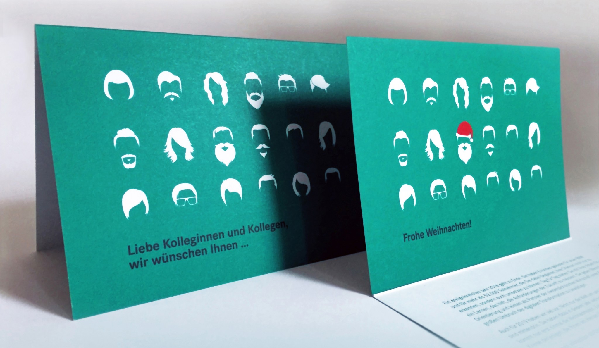
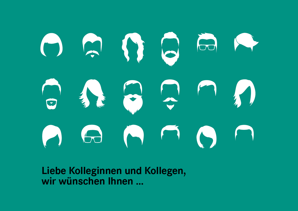
HIER NUR VIER VON VIELEN MÖGLICHEN BEISPIELEN

Nach Designvorlage
Die Aufmachung hat sich bewährt. Der Leser kennt das Format und man möchte diese Erwartung erfüllen. Das Corporate Design gibt klare Regeln und Vorgaben für das Layout. In diesem Fall kann eine InDesign Vorlage aus dem Vorjahr übernommen werden oder das Layout anhand des letzten Berichts nachgebaut werden. Es werden neue Inhalte eingefügt, das Layout hingegen wird kaum verändert, sondern nur optimiert.

Der Besondere
Das Unternehmen hat international expandiert oder ein Jubiläum steht an und der Bericht wird mit einem Extrateil über die bisherige Unternehmensgeschichte ergänzt? Dieser Bericht wird umfangreicher als bisherige, denn dieses Jahr war etwas ganz besonderes und das soll auch mit einem besonderen Design visualisiert werden!

Zahlen & Fakten
Eine Zahlenwüste sollte mit anderen Inhalten aufgelockert werden. Beide Teile – der Zahlen- und der Imageteil – könnten aber auch klar in zwei Abschnitte unterteilt werden oder sogar in zwei unterschiedlichen Heften erstellt und dann gemeinsam in einer Mappe präsentiert werden. Wird eine Imagebroschüre jedoch grundsätzlich separat und womöglich zu einem anderen Zeitpunkt im Jahr herausgegeben, wird sich das Design  auf die Darstellung der Zahlen und Fakten konzentrieren und diese mit anschaulichen Infografiken präsentieren.

Der Unterhaltsame
Der Bericht soll auch Geschichten aus dem Unternehmensalltag erzählen und Mitarbeiter zu Wort kommen lassen. Er soll einen Rückblick auf erfolgreiche Veranstaltungen geben, aber auch von besonderen Ereignissen berichten, die nicht unbedingt im direkten Zusammenhang mit der Jahresbilanz stehen. In diesem Fall könnte sich das Layout zum Beispiel dem eines Magazins annähern, das unterhaltsame Berichte entsprechend präsentiert. Illustrationen oder Fotos und deren Bildqualität, werden hier eine besonders wichtige Rolle spielen.

Tipps, für die Umsetzung eines erfolgreichen Geschäftsberichts und eine ausführliche Beschreibung der einzelnen Phasen des Designprozesses, beschreibe ich in diesem separaten Post

Thanks for stopping by. Please stay in touch by following my blog here.

back to top

How to Get the Most Out of Your Budget (1): Individual Design Job

by Britta

When asked for an individual design job for a single medium, I always remind my clients to use their final artwork for different platforms in order to make the most of what they’ve paid for.

The creative part of a design job often takes up the most time and budget. After researching the target group and competitors, it involves creating the look and feel, coming up with an innovative idea, developing different layouts, discarding some of them and tweaking others. The next step – transferring the final design onto the print or online target media – is often much less time-consuming.

Every campaign requires advertisement on various platforms. While most channels are included in the concept up front, adding even more is comparable budget friendly, as the main part – creating an idea and design for your campaign – is already done and will only be multiplied to another format. The same applies to most other media: If you have a magazine, get a printed version as well as an e-book. If you place an ad, create an animated google-ad using the same elements. When your annual report is final, also offer a digital version for download on your website. If you advertise with flyers, use the slogan you came up with for a newsletter …

Example of a small project with a simple solution: A christmas card goes digital

Recently, one of my clients asked me to design their christmas card. They wanted a four-page card in an A6 format with a modern and fun design to send out to their 1.200 employees.

weihnachtskarte_konzepte

weihnachtskarte_final

I presented three initial concept ideas. The design versions went back and forth between me and the client as well as within their department until the final text and layout was chosen. The biggest chunk of the budget went to this creative process, followed by printing and direct addressing by the printers. Then, once the decision for a final design was made, it took little time and budget to also create a gif for my clients facebook page and a small mp4-video for their instagram account.

weihnachtskarte_animation

Not every print design is as easily transferred to an online platform as this card. Sometimes the content needs to be further developed to accompany existing channels and to suit the medium. Normally it’s worth it – make the most of what you’ve paid for!

If you are interested in a breakdown of costs for your next project, drop me a line at info@brittafocke.com

Thanks for stopping by. Please stay in touch by following my blog here.

back to top

Using Static Images With Motion Illusion

by Britta

Some platforms don’t allow videos or animated pics, but there are other ways to get the illusion of motion even though you’re using a static image. While not replacing a proper animation, they are simple to use and have a subtle, unexpected effect.

There are many fantastic pics out there with motion illusion. One thing I normally don’t like about them is their psychedelic design. Here are two examples with a more contemporary look and feel:

Motion Illusion6

Motion Illusion7

They work best in a narrow format such as a newsletter, where the motion illusion becomes apparent, once the user starts scrolling up and down the screen.

I first made use of this effect when I designed the newsletters, accompanying the campaigns for the new UTS Institute of Research and Open Day:

Motion Illusion_Examples of my work2

Motion Illusion_Examples of my work

While these motion illusions become apparent when the reader starts scrolling, there are similar images that work without and could be incorporated in a printed poster- or postcard design.

Any campaigns you can think of that might want to make use of this concept?
info@brittafocke.com

Thanks for stopping by. Please stay in touch by following my blog here.

back to top

How to Keep Up With Your Kids Artwork

I have two little artists at home, creating drawings on a daily basis. Some of them are beautiful stand-alone pieces. Many others are smaller, half done doodles. At the end of the year, we normally go through their portfolio and decide which ones to keep and what to do with the other pile – too many to store, too precious to toss. Any ideas?

My son suggested to cut out all the smaller individual pieces and glue them onto colored cardboards. That way we created several large collages. The biggest one fits a 720 x 1000 cm picture frame and now takes pride on my office wall.

IMG_7150
Framed_Collage

We created differently themed sections: Fishes (and some unidentifiable creatures) into the pond. Flowers onto the lawn. Cars and trucks behind each other („in a traffic jam!“). Butterfly and monsters, flying in the sky ;)

Another thing we often do is, reuse the artwork as wrapping paper for family and our kid’s friends presents.

I also really like the idea of conserving your kid’s artwork in an annual photo book like this. Or check out this dad’s work, adding his own artistic touches to his kids drawings.

Thanks for stopping by. Please stay in touch by following my blog here.

back to top

Minimal Ads

by Britta

Taschen Bauhaus Tischlampe

I recently came across this ad from 1925, featured in Taschens’ book about the bauhaus period. It was deliberately factual, describing the technical highlights only. It appears almost naive in comparison to the complex colorful ads we’re used to today. Rom magazine though, is now trying a new (old) approach. As described in this article, their ads regain credibility through limiting their clients’ freedom in design.

ROM-magazin_Scan-10

I agree that sometimes less is more. Too much blabla distracts from the core message and good design needs a clear focal point. Our lesson: Nothing stands out if everything is highlighted as important. Also, when designing an ad, have in mind where it’s published. On a static website it might need some bling and a spread in an otherwise black and white newspaper might gain attention with a colourful design and bold typography. When advertising in a high-gloss magazine though, a design-reduced ad with white background will often be your best choice.

Thanks for stopping by. Please stay in touch by following my blog here.

back to top